Autumnation by Sixpoint
The release of Sixpoint’s sleek, gleaming 16-ounce tallboys in May was a pivotal moment in the canned-beer revolution. Showcased in streamlined four-packs, they were a traffic-stopper in packie aisles in New York, New Jersey, Massachusetts and Philadelphia. For many consumers, it was Sixpoint’s reputation for stellar beers that drew them in. Novelty probably also played a role—cans are quite the trend. But neither would mean nearly as much if the wraps weren’t so elegantly designed.
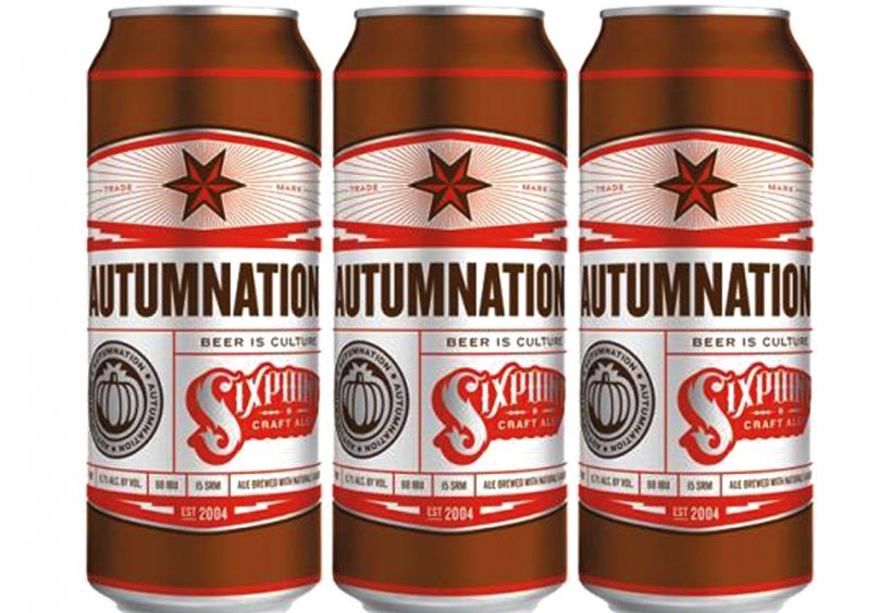
“A buyer is sometimes just attracted to the beer simply because of the visual on the package,” says Nate Garn, co-designer of Sixpoint’s cans, including Autumnation, a wet-hopped Pumpkin Ale and Sixpoint’s first seasonal canned release.
“There’s a certain amount of honesty that goes along with the labeling, too, as far as it actually representing the personality of the brewery,” Garn continues. “For example, you look at the labeling on the Sixpoint cans and right away, you see it’s very structured and there’s order to it, and that really reflects a lot of their philosophy. They’re very pragmatic and organized. It’s just the perfect reference to the brewery itself.”
Sixpoint was originally working with a more “turn-of-the-century woodcut design” when they started tinkering with an aesthetic. Then they realized they weren’t alone—lots of new microbreweries were coming up with similar looks based on the “handcrafted” theme. So Garn, his co-designer, John Rockwell (the two work at Lefty Lexington in Wisconsin), and Sixpoint founder Shane Welch started collaborating on a design that was “more industrial and modern and clean, which jibes a lot with the particular part of Brooklyn that Sixpoint resides in,” Garn explains.
The team was also after a template that could be replicated from beer to beer, which, as Garn points out, is rare. “Portions of this modular design can change, but overall, it’s a very consistent network of identity that’s sort of unusual for beer. A lot of microbrewers, one beer to the next, they kind of change. While they’re interesting, sometimes you may not know that the same microbrewery is producing a different beer.”
What will change, besides the colors and beer info, is the “medallion” to the left of the logo—for Autumnation, the pumpkin. “The pumpkin concept was a no-brainer,” laughs Garn. Others will be less straightforward, he says.
“The body of the can is essentially a 360-degree canvas,” says Garn, “and typically hold as many as six ink colors. The underlying metal substrate allows for interesting color combinations, and, in the case of Sixpoint, the raw aluminum becomes part of the design.”
For each new release, Garn and Rockwell even make the trip to the printer, Rexam, in Chicago to proof the colors themselves. “We’ll see the ink hit the aluminum can,” Garn says. “It’s very cool.” ■
 Previous: Double Brown Ale
