All of Gigantic’s labels are designed to look like the cover of a comic book, including the surreal, tripped out image created for The City Never Sleeps by children’s book author J. Otto Seibold.
Whether it’s a reminder of friends and family, or a tribute to that first eye-opening brew, these beer-logo tattoos are proof that craft beer can mean more than just a tasty drinking session.
The guys at DC Brau aren’t afraid to creep people out. So when it came time to conceptualize their next beer, the dark side was the first place they went.
The mythological art on Pipeworks’ Glaucus Belgian-style IPA can be traced back to a cartography exhibit at the Field Museum of Natural History in Chicago.
Artist Adam Forman created the spooky imagery that’s been part of the brewery’s identity since it opened in 2004—from their toothy jack-o’-lantern logo to creepy scarecrows and pumpkin-patch graveyards.
The new Merry Monks label is part of a major overhaul of Weyerbacher’s branding and the scene captures the mischief that in part defines Weyerbacher as a brand.
The label art for a new beer from Massachusetts-based Pretty Things Beer & Ale Project dips into the part-fictional, part-real life world Dann and Martha Paquette are constructing.
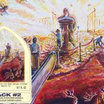
The label design for Track #2 was created for the brewery’s series of beers inspired by rock anthems. The label started with Tomme Arthur’s idea to depict “Knockin’ on Heaven’s Door” by Guns N’ Roses, but morphed into Led Zeppelin’s “Stairway to Heaven.”
Just like there is no typical craft beer, there seems to be no typical craft logo. And with the ongoing proliferation of craft breweries in the US, branding is becoming both more crucial and more impressive than ever before.
Coming up on its 20th anniversary, Uinta decided it needed a makeover. So between 2010 and 2011, they turned to local artists to redesign their logo and labels.
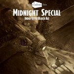
What he came up with was the stark-contrast, dramatic image of a prisoner illuminated by the headlights of a train careening through the prison walls, just feet from the cell cot where our character sits.
There’s something nostalgic about Keith Shore’s otherworldly images: the appearance of texture on a flat image, the high-contrast, super-blended colors, the minimalist rendering of one action-packed snapshot that challenges the viewer to fill in the details.
For many consumers, it was Sixpoint’s reputation for stellar beers that drew them in. Novelty probably also played a role. But neither would mean nearly as much if the wraps weren’t so elegantly designed.