Each Fieldwork label features a different image, spread across the entire surface of their cans to make an impact and embody the Bay Area brewery’s adventurous spirit.
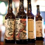
The labels for Polish brewery AleBrowar are designed to separate its beers from mass-produced products and send an unequivocal message that it is artisan beer.
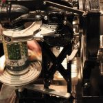
Designed by an upstart brewer, this more affordable, manual four-head counter-pressure filling system can fill bottles of many sizes. Plus, its portable size comes in handy in a variety of situations.
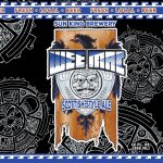
For a brewery whose marketing director started out washing kegs, Sun King’s redesign isn’t surprising. Even the Indiana brewery’s milestones are couched in a beta mindset.
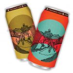
In the can art for The Keeper’s Veil, a honey Saison, each side represents an extreme—a beekeeper in the spring and summer of her life, and a dark, heavy scene of death and decay.
Second Self embraced the “Top Gun” nostalgia with its summer seasonal, creating a video spoof of the famous volleyball scene and including movie quotes on the bottoms of cans.
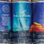
When creating the Double IPA’s label art, capturing the evolution of a brewer into a hop monster in a single image took about three months of collaboration between the Florida brewery, its branding agency and an illustrator.
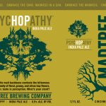
To create the art for MadTree’s IPA, designer Margaret Weiner made a composite of inkblots that combine the shape of a hop bud, a maniacal face, and branches and roots.
A gift of six hand-selected beers deserves to be carried and presented in something a little more special than a used six-pack holder—especially for special occasions. That’s why Ashley Edmonds created Beer Greetings.
As more breweries choose cans, often at minimum quantities, the three can producers—Colorado’s Ball Corp., London’s Rexam and Pennsylvania’s Crown Cork & Seal—are struggling with an influx of new orders.
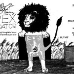
Apex Predator—and every Off Color label—is black and white. But what may seem simplistic—a pen-and-ink drawing that started as a Sharpie sketch on a bar napkin—is, of course, not so much.
Imperial Pumpkin Ale mixes it up as one of the brewery’s first labels featuring art. A nod to Tim Burton and the spirit of Halloween, the “foggy autumn night sky at a pumpkin patch” is a departure from the minimalist look of other Reuben’s Brews labels.
Known for pioneering canned beer packaging, Oskar Blues was looking for a new way to push the aluminum container’s limits while solving some of the glass growler’s inherent downsides. They ended up with the Crowler.
Cans are now instinctively what I reach for when I’m buying beer in the store, much to my own surprise. In fact, I expect to keep passing over glass bottles, bombers and growlers for many years to come.
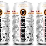
Smartmouth has a way of winning people over to the nerdy side. From the metabolic flows of fermentation to the yeast pitch rate formula, the cans become a resource for people to study while they drink.
Artist Keith Neltner’s rendition of a real-life rooster who once “ruled” the farm owned by Cecil Fecker, Nathan Hukill’s grandfather, was designed to wrap the brewery’s first release, an Imperial IPA brewed with nine hop varieties, five malts and a botanical blend.
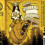
The name “Forest Dweller” could inspire all sorts of imagery. Leave it to Crooked Fence to come up with a primitive-looking woman riding a bear with lightning bolts coming out of its mouth.
As craft beer’s influence in convenience and larger chain stores grows, so has the availability of variety packs. In 2014, variety packs were up 21 percent by volume in retail sales.